We’re in the calm after the Google virtual storm. How did your site do?
Here’s what we all got worked up about last month:
Google demands mobile-friendly websites for mobile search – does your site pass?
Google announced its mobile search algorithm would change to prioritize mobile-friendly sites over non-mobile friendly sites, effective April 21, 2015. The announcement was on February 26, 2015, on their Webmaster Central Blog. Here is their exact language:
Starting April 21, we will be expanding our use of mobile-friendliness as a ranking signal. This change will affect mobile searches in all languages worldwide and will have a significant impact in our search results. Consequently, users will find it easier to get relevant, high-quality search results that are optimized for their devices.
Here’s the link to that blog post.
http://googlewebmastercentral.blogspot.com/2015/02/finding-more-mobile-friendly-search.html
Last we checked, Google controls 67% of all US search traffic (and 58% of global), compared to 19% for Bing and 10% for Yahoo.
What does this mean? And how does it affect your adventure site? Let’s start with what it means.
More mobile-friendly websites will show up in search results. Incidentally, also in this same announcement, Google said it will also start to use information from indexed apps as a factor in ranking for signed-in users who have the app installed. This currently includes only Android apps in the Google Play store, not iPhone apps (oops, Apple smackdown). Does this affect you? Well, only if you have an app for your adventure company, a lot of users on that app and you index your app. Very few adventure companies have this so far.
So, how does this affect your Adventure site?
If your site is not already mobile-friendly, it may well drop in the mobile search results. Your site may even disappear from mobile search results completely over time, depending on how many alternative mobile-friendly results are available for Google to show. Let’s do some math next: What percentage of your total traffic finds you initially via mobile devices? For our adventure company clients, it varies between 35% to 60% in any given month, and will only increase going forward! Let’s see- 30,000 visitors a month, and 50% struggle to find you – hmm, that’s 15,000 visitors lost, – you get the point. Note that typing in your company name is not organic search, and Google will still show your company in its results. It’s when you type in “Ocoee Rafting” that you might not show up.
Google’s Webmaster Tools Tried To Tell You
Just to be sure you got the information, Google took it a step further and sent out email messages to the webmasters of record on all google analytics accounts, specifically calling out YOUR mobile usability issues that need to be fixed, prior to April 21st. I know you were in the thick of pre-season staff training, equipment reviews, and final construction projects. You could’ve missed it, for sure.
Here’s an example:
Fix mobile usability issues found on http://yourdomain.com
To: webmaster of http://yourdomain.com
Google systems have tested 38 pages from your site and found that 26% of them have critical mobile usability errors. The errors on these 10 pages severely affect how mobile users are able to experience your website. These pages will not be seen as mobile-friendly by Google Search, and will, therefore, be displayed and ranked appropriately for smartphone users.
If your site is not seen by Google as mobile-friendly yet, Google is directly telling you that it will lose ranking in mobile search results.
How do you tell if your site is mobile-friendly by Google or not?
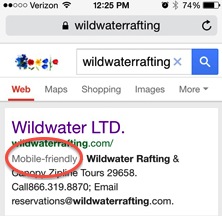
Search for your company on a mobile device, the Google-generated tag “mobile-friendly” will come up right below your URL, before your site description, in the search results. See this example of mobile search result:
How does Google define mobile-friendly?
A page is eligible for the “mobile-friendly” label if it meets the following criteria as detected by Googlebot:
- Avoids software that is not common on mobile devices, like Flash
- Uses text that is readable without zooming
- Sizes content to the screen so users don’t have to scroll horizontally or zoom
- Places links far enough apart so that the correct one can be easily tapped
Just because your website is already responsive doesn’t guarantee that Google thinks so, too. Do not assume that all is well. Find out what Google actually sees on your site now. Even fully responsive websites may have items that can be adjusted. Its not uncommon for your robots.txt file to be blocking key items such that Google can’t “see” all of your sites. Google Webmaster Tools will show exactly what Google sees, and how to fix this. If you don’t look, you won’t know.
A note on Responsive Web Design: don’t bother with anything else for your website.
This is straight from Google:
“Responsive web design” or RWD means that the page uses the same URL and the same code whether the user is on a desktop computer, tablet, or mobile phone – only the display adjusts or “responds” according to the screen size. Google recommends using RWD over other design patterns.
Does this affect desktop search results?
Not yet – the changes are only for mobile search results. Don’t get too comfortable though, we see our clients’ mobile search traffic doubling annually in the adventure industry. What’s yours doing?
This is a like an open-book test from Google.
The good news for you is that Google’s email message tells you exactly what Google thinks is wrong, item by item, and how to fix it. The bad news is, fixing it can be technically challenging. The good news is – it is fixable! If you don’t have the skill-set in-house or a team already outsourced to fix your site, find an expert fast. Don’t even think about muddling through this on your own – you have a business to run and the stakes are, oh, only 50% of your website traffic. For example, we invest in an SEO mastermind group run by Search Engine News, and have direct access to their top SEO experts in the country on a daily basis – that’s how important this stuff is to us.
You Need These 3 Tests & Google Webmaster Tools:
Use these tests to determine if your site is headed for a Google mobile smackdown, and how to prevent it.
Step 1: Take the Mobile-Friendly Test
Find out if your site passes or not. Here’s the link.
https://www.google.com/webmasters/tools/mobile-friendly/
You don’t have to be logged into webmaster tools. This is the only test that will tell you if your site is eligible for the mobile-friendly label generated automatically by Google Search.
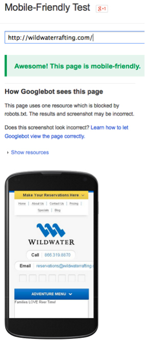
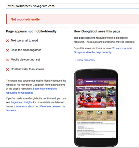
Green is go; Red is stop. (Yellow means gun it, according to a three-year-old in the back seat years ago, but I digress…)
Example of a site that passes Google’s Mobile-Friendly Test:
Example of a site that does not pass Google’s Mobile-Friendly Test:
Step 2: Take the Mobile Usability Test
Log into your Google Webmaster Tools with your Google account, select your company’s site, then click on Search Appearance > Mobile Usability. Enter your URL (be sure its canonically correct, www or non-www). (Note: If you do not have your site set up to use webmaster tools yet, you will want to do so right away. Log into your google analytics account and open a new tab at https://www.google.com/webmasters/tools/. Google will walk you through how to verify your site you can start using webmaster tools with it.)
Here’s what it looks like:
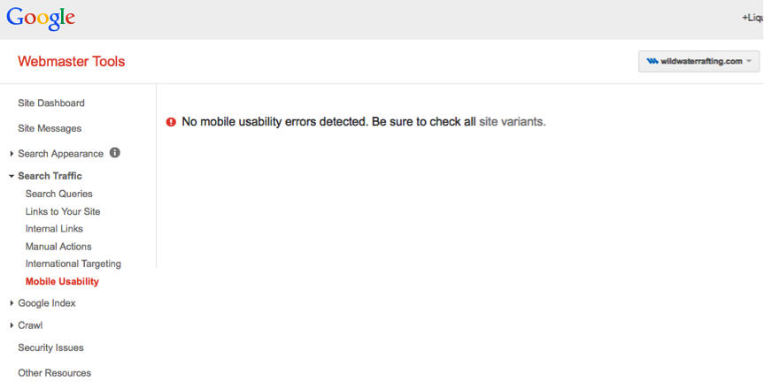
If your mobile usability report comes back with errors, it will list exactly what type of error Google sees, and you can drill down to every page with that error. No guessing needed.
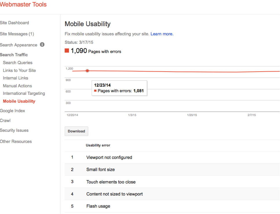
Step 3: Next click on Crawl > Fetch & Render as Google.
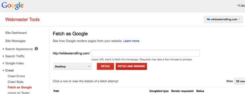
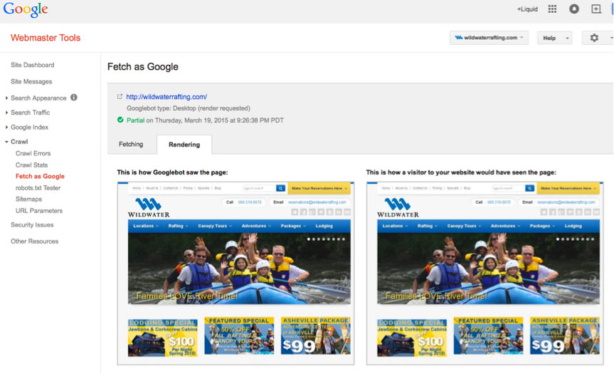
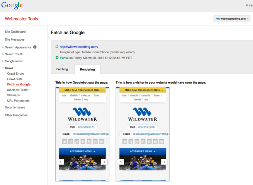
This gets interesting. You will see exactly how Google sees your site for the desktop version and the mobile smartphone version. Choose “Fetch & Render” so you can see exactly what Google, and visitors to your site, see.
If you don’t see your homepage or only part of your home page, you have a robots.txt blocking problem. Google can’t see your site page because you are blocking it with something in that code. Delete the offending code (Google will tell you exactly what line it is) and re-run the Fetch and Render test.
Here’s what the Fetch & Render result looks like for the desktop version.
Here’s what the Fetch & Render result looks like for the mobile smartphone version.
Extra Credit:
What is Google Page Speed Insights?
This test gives you a relational score for your site speed on mobile and desktop, and rates your mobile usability experience results overall. It will tell you at a summary level what categories of errors you have and how to fix to make your site load faster and be mobile-optimized.
Here is that URL: https://developers.google.com/speed/pagespeed/insights/ Use webmaster tools mobile usability test instead, to get the details on every page of your website.
Page Speed Insights and Adventure Company Websites
Page speed insights is a pain-in-the-you-know-what to adventure companies, its true. Here’ why – Google rates the relative load time speed of your mobile and desktop website versions and gives you a red, yellow or green rating for poor, caution, and good. Google wants super fast websites, which is easy with a text-based site (like Google), but much harder with an image-rich site, like we use in adventure tourism. Visitors to our websites are engaged through strong imagery and emotional evoking of senses. What to do?
- You have to make tradeoffs between image sizes (resolution) and site loading speed. Keep it in perspective: you are optimizing for humans, not computers at the end of the day. Humans buy your adventure trips, computers do not.
- Your Desktop speed should be green. Don’t stop till you get that result.
- On Mobile speed, you may well have to settle for yellow, though keep pushing for incremental improvements, but not at the expensive of poor resolution images.
What’s the difference between PageSpeed Insights UX Score and the Mobile-Friendly Test results?
Here is Google’s answer: The Mobile-Friendly Test (MFT) uses Googlebot to fetch the page. PageSpeed Insights does not use Googlebot, but fetches the page in a way that mimics how a real user fetches the page. This means that the MFT follows robots.txt rules and PSI does not. If Googlebot is blocked from fetching the page, JavaScript, CSS, or other resources, the MFT may not be able to detect if a page is mobile-friendly. If you want to know if a page is eligible for the mobile-friendly label in Google Search, you need to use the Mobile-Friendly Test.
We hope this has cleared up any confusion for you over what Google is up to, how it could impact your website, and what to test for to understand how to maximize your site for in the brave new “mobile-friendly required” world of gorilla Google. Fixing it, we know, is another story. Luckily, there are pros to help you with that so you can run your adventure company. Send us your questions and we’ll be glad to help set you up for mobile-friendly success.
One of my favorite quotes from Casey Markee, founder of MediaWyse, our kickass colleague and SEO expert at Search Engine News is:
An expert is someone who has made all the mistakes possible in a particular field and can advise the rest of us in how to avoid them.
It will all be ok, just get your adventure website on track to be mobile-friendly. Now is the time!

